20 Best Sample of a Landing Page Examples to Boost Your Conversions
Need a sample of a landing page to inspire your next project? Here are 20 of the best examples that demonstrate what makes a landing page effective in driving conversions.
Key Takeaways
- Landing pages are specialized web pages focused solely on conversion, aimed at persuading visitors to take a specific action, like signing up or making a purchase.
- Key elements of a high converting landing page include a compelling headline, a clear call-to-action, engaging visuals, and trust elements like testimonials and reviews.
- A/B testing is crucial for optimizing landing pages; it helps determine which elements perform best through data-driven comparisons, leading to improved conversion rates.
0 Introduction
In the vast digital ocean, capturing potential customers’ attention can be challenging. However, the humble landing page stands as a beacon, effectively converting landing page visitors into leads or even customers. This standalone powerhouse is the key ingredient that adds a sizzle to digital marketing campaigns, delivering your message directly to your audience.
As opposed to your website’s homepage, which serves various purposes, a landing page focuses on a single goal, message, and action. This focused approach can transform a casual visitor into a loyal customer. From offering promo codes to unlocking valuable insights, landing pages are the digital handshake that starts the customer relationship off on the right foot.
Therefore, for those aiming to enhance their online presence and drive results, a well-crafted landing page isn’t simply an added bonus; it’s a necessity in your marketing strategy.
What is a landing page?

What do we mean when we refer to a “landing page”? Picture a digital concierge, ready and waiting to greet visitors with a personalized offer the moment they arrive from an email, ad, or another online pathway. This is the essence of a landing page – a standalone web page designed with a laser focus on one thing: conversion. It’s a page that harnesses the entirety of its design and content to persuade visitors to take a specific action, be it signing up for a newsletter, booking a demo, or making a purchase.
In contrast to the broader informational focus of a homepage, most landing pages prioritize specificity and relevance. There are two main types: lead generation pages that aim to gather customer data, and click-through pages that whisk users toward the next step in their buyer’s journey. In the world of digital marketing, where attention spans are short and competition is fierce, a high converting landing page isn’t just a tool; it’s your strategic secret weapon in enticing and converting your target audience. By understanding the unique features of other landing pages, you can optimize your own to achieve better results.
Key elements of a high converting landing page
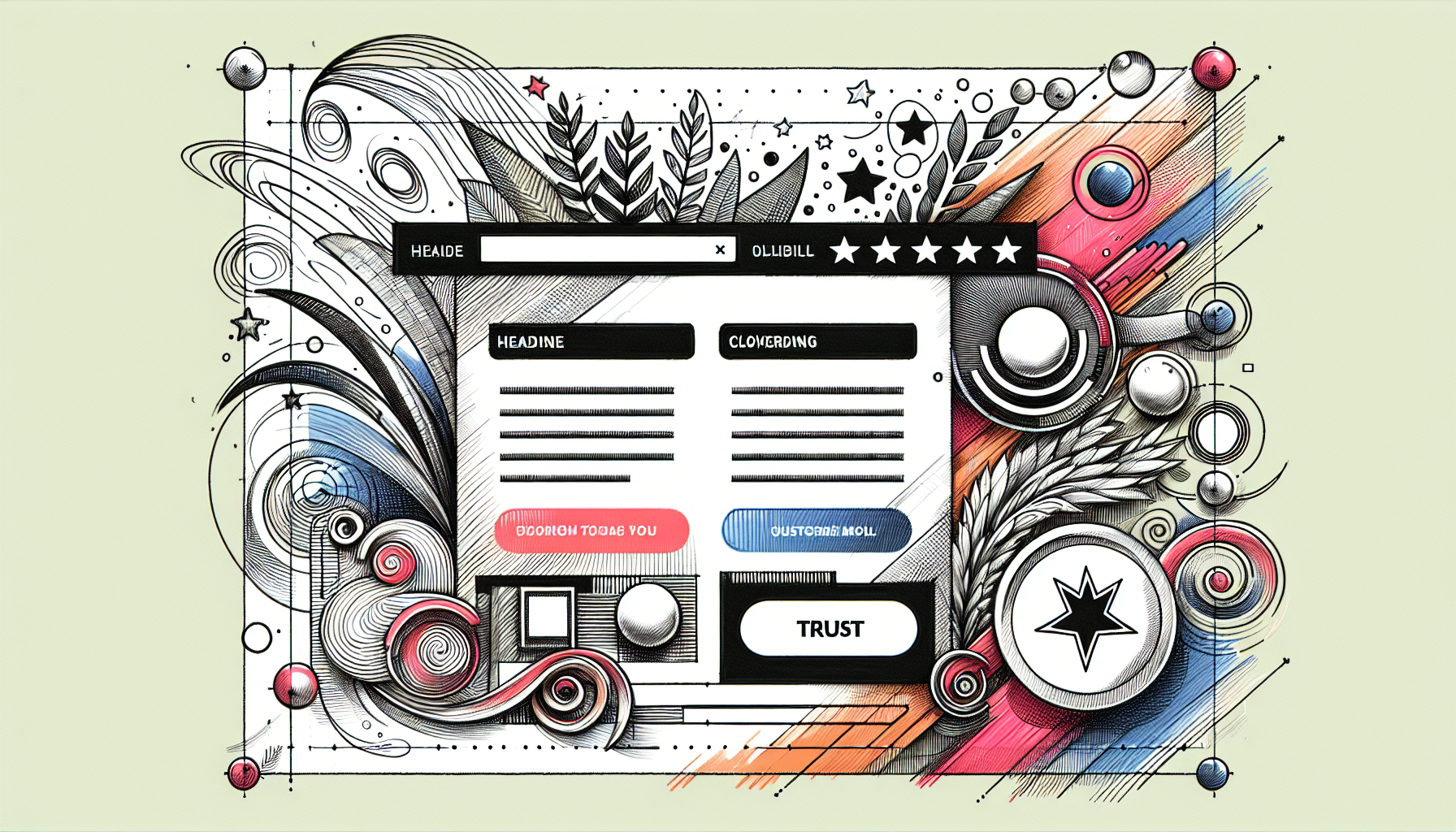
Dive into the anatomy of a high converting landing page, and you’ll find several critical elements pulsing at its core. First, the headline – it’s the first thing your visitors will see, and it needs to be a knockout. Think of it as the headline of a newspaper; if it doesn’t grab you, you’re not going to read the story. It has to be attention-grabbing, clear, and aligned with the value proposition.
Next up is the call-to-action (CTA), the page’s beating heart. This isn’t just a button; it’s the culmination of your page’s persuasive powers, urging visitors to take that vital next step.
But that’s not all. A high converting landing page is also a visual treat, with eye-catching images or videos that complement the message and add an engaging dimension to the user experience. Add to this the trust elements – customer logos, testimonials, reviews – that serve as endorsements of your offering, and you’ve got a recipe for a landing page that not only looks good but also convinces and converts.
Balance these elements with a clean, distraction-free structure, and you’re well on your way to crafting a landing page that turns visitors into advocates.
20 best sample of a landing page examples for inspiration
Now, let’s examine some of the most excellent examples of landing pages. These aren’t just good landing pages; they’re the best landing pages that have raised the bar for what a landing page can achieve. From the clear-cut simplicity of Netflix to the strategic depth of ClickFunnels, we’ve rounded up 20 of the best landing page examples that are sure to leave you brimming with ideas. These examples not only showcase stellar design and smart conversion tactics but also offer a glimpse into the diverse ways landing pages can be leveraged across various industries.
Each example in our showcase is a masterclass in landing page design, demonstrating the key elements we’ve just explored. They serve as a source of inspiration, a set of landing page examples that can ignite your creativity and help you craft your own high converting landing pages. So, as we delve into these landing page example, keep an eye out for the clever use of CTAs, the persuasive power of testimonials, and the visual appeal that each page brings to the table.
Are you ready to get inspired? Now, let’s explore further.
Netflix
Netflix knows the power of simplicity. Their landing page is a textbook example of how to do it right, with:
- a clear and concise headline that leaves no room for doubt about what’s on offer
- a page designed to draw you in and get you started with just a few clicks
- an easy sign-up process that encourages visitors to dive into their vast library of streaming content
It’s an invitation to endless entertainment, presented in a way that makes resistance futile. If the goal is to convert visitors into subscribers, Netflix’s landing page is a shining beacon of conversion efficacy.
Zoom
Zoom’s strategy is all about building authority and trust from the get-go. By offering visitors a free report, they’re not just capturing email addresses; they’re establishing themselves as experts in their field. The page stands out with its own boss-like confidence, featuring high-quality images and video testimonials that resonate with the target audience.
The eye-catching design and clear call-to-action ensure that visitors know exactly what to do. Whether you’re a seasoned professional or just starting out, Zoom’s landing page makes it clear that they have the tools to take your video conferencing game to the next level.
Constant Contact
Constant Contact’s landing page is a masterclass in targeted marketing. Real estate companies looking for a leg up in their marketing efforts will find a trove of valuable insights with the free download offered. The layout is a model of clarity, balancing a spectrum of colors to create a user experience that’s both inviting and informative.
With a prominent call-to-action button and easy access to essential resources, this page is a beacon guiding real estate professionals to marketing success – all from the convenience of their mobile devices.
Lyft
Lyft’s landing page is the epitome of straightforward messaging. With a giant headline that’s impossible to miss, it sets clear expectations for potential drivers. The page is stripped down to the essentials – no fluff, just an enticing proposition that speaks directly to those looking to earn on their own terms.
The ‘Apply to drive’ button is as prominent as a green light on an open road, beckoning visitors to start their journey as a Lyft driver. And with a minimalistic sign-up form that’s as easy as entering a mobile number, the path from visitor to driver is as smooth as the ride you’ll be offering.
OptinMonster
OptinMonster’s landing page is a fortress built for one purpose: lead capture. It’s a shining example for SaaS businesses, demonstrating how to effectively gather leads without clutter or distraction. The sign-up form takes center stage, compelling visitors to join with a promise of unlocking the full potential of their marketing campaigns.
With all the essential elements working in harmony, the page stands as a testament to OptinMonster’s expertise in conversion optimization – a beacon for those seeking to transform their visitors into a growing list of engaged subscribers.
Codecademy
Codecademy’s landing page speaks directly to the hearts of web developers and aspiring coders. It’s a bold statement in design, with vibrant colors that leap off the screen and ample white space that gives each element room to breathe. The page is a visual representation of Codecademy’s approach to learning – clean, focused, and uncomplicated.
By emphasizing key information through web design that’s both functional and aesthetically pleasing, they’ve created a landing page that doesn’t just inform; it serves as landing page inspiration, inspiring action and the desire to start coding right away.
Airbnb
The Airbnb host sign-up page is a roadmap to becoming a part of the sharing economy. It’s an inviting journey that guides potential hosts through the steps of listing their space with clarity and charm. The design is crisp, with visuals that highlight the joys and benefits of hosting. Each step is laid out with precision, ensuring that visitors are never lost but always one click away from unlocking the earning potential of their home.
This landing page isn’t just a destination; it’s the start of an adventure in hospitality.
Asana
Asana’s landing page is a sanctuary of organization aimed squarely at product managers. It’s a testament to the power of a well-structured page, with clear chunks of information that are easy to digest. Multiple call-to-action buttons punctuate the narrative, offering visitors numerous opportunities to jump in and start streamlining their workflows.
The design is a visual echo of what Asana offers – clarity, focus, and the promise of a more productive team. In the bustling world of project management, this landing page is a calm, convincing voice that says, ‘We’ve got you covered.’
SEMRush
SEMRush’s landing page is like a bright neon sign for marketers, shining the spotlight on their webinars. With a clear button that jumps off the page and a focus on the benefits of attending, it’s a masterful play to attract visitors who are eager to level up their marketing game.
The colors are bright, the message is clear, and the page is designed to convert curious visitors into webinar attendees. SEMRush knows their audience, and their landing page works like a well-oiled machine, tuned to deliver value-packed sessions that marketers won’t want to miss.
Dropbox
Dropbox’s landing page is a welcome mat rolled out specifically for Android users. It’s a no-nonsense approach that gets straight to the point, showcasing a straightforward sign-up process designed to make integration with Android devices a breeze. The page is a model of targeted design, creating a direct pathway for visitors to start using the service with minimal effort.
In the crowded world of cloud storage, Dropbox’s landing page stands out by making it clear that they’re not just offering a product – they’re offering a seamless extension of the user’s digital life.
Smash Balloon
Smash Balloon’s Black Friday landing page features:
- A visual spectacle that captures the excitement and urgency of the shopping season
- A bold design that pops and effectively draws attention to the discounts on offer
- A masterclass in using seasonal campaigns to drive sales, with a design that’s as striking as it is persuasive
For visitors looking to upgrade their social media tools, this landing page is a clear signal that now is the time to act, and Smash Balloon is the place to shop.
Dreamforce
Dreamforce’s landing page features:
- A crisp layout
- Engaging visuals
- Clear directives that guide users through the sign-up process
- A hero image that captures the energy of the event
This landing page is a beacon for professionals looking to expand their horizons.
It’s more than an entire page; it’s an invitation to be part of something bigger.
Digital Marketer
Digital Marketer’s landing page brings its training program to life with high-quality video content that does more than tell – it shows. By allowing prospective learners to see the value of their offerings in action, they’re engaging the audience in a dynamic and compelling way. Video testimonials serve as social proof and draw the visitor deeper into the Digital Marketer ecosystem.
This landing page doesn’t just describe what’s in store; it provides a window into the world of advanced digital marketing skills, making it clear why signing up is the right move.
Taboola
Taboola’s landing page is a gateway to knowledge, offering a compelling value proposition with a spotlight on their ebook. The page is designed to intrigue and inform, with a yellow bubble around the CTA button that stands out boldly against the backdrop. It’s a clear call to action that encourages visitors to obtain the ebook and, by extension, to engage deeper with Taboola’s platform.
This landing page is a testament to the power of offering something of value upfront, positioning Taboola as a thought leader in the content discovery space.
Shopify Plus
Shopify Plus’s landing page speaks directly to the big players in commerce, addressing their unique challenges and concerns. With professional video content that showcases the platform’s capabilities and clear results that attest to its effectiveness, Shopify Plus asserts its position as the go-to solution for high-volume businesses.
The page is crafted to resonate with decision-makers looking for robust, scalable solutions, offering a glimpse into the transformative impact Shopify Plus can have on their operations.
Webflow
Webflow’s landing page features:
- An animated GIF that showcases the functionality and elegance of its no-code design tool
- A layout that mirrors the creativity and freedom Webflow offers
- The GIF serves as a live demonstration, providing a sneak peek into the workflow that users can expect.
This landing page is a clear reflection of Webflow’s understanding of its audience – designers who value aesthetics, functionality, and the ability to bring their ideas to life without coding.
ClickFunnels
ClickFunnels’ landing page features:
- Stories and testimonials that resonate with the dreams of entrepreneurs and marketers
- Emphasis on ease of use and the achievements of others
- A compelling showcase of what’s possible when you have the right tools at your disposal
By emphasizing these elements, ClickFunnels not only persuades visitors to sign up but also instills a belief in their own potential success.
The landing page serves as a catalyst for action, painting a picture of the future that ClickFunnels can help create.
Conversion Lab
Conversion Lab takes an innovative approach by making its entire homepage double as a landing page. This seamless integration ensures that visitors are immediately immersed in the value proposition without the need to click through multiple pages. The design is intuitive, providing all necessary information upfront and making it easy for visitors to understand what Conversion Lab offers.
By blending the homepage with the landing page, they not only streamline the user experience but also reinforce their expertise in conversion optimization.
Bullet Journal App
The Bullet Journal App’s landing page is an ode to minimalism, stripping away the unnecessary to focus on what truly matters. With sparse content and a strategic use of headings and images, the page communicates its message effectively and without overloading the visitor. It’s an approach that reflects the very essence of the Bullet Journal method – organization, simplicity, and clarity.
This landing page is not just about selling an app; it’s about inviting visitors to embrace a lifestyle of mindful productivity.
Doordash
DoorDash’s landing page is a rallying cry for those looking to take the driver’s seat in their work life. With a straightforward sign-up process and clear benefits such as potential earnings and flexibility, the page is a magnet for individuals seeking an alternative to the 9-to-5 grind. While the landing page is effective in its recruitment focus, the addition of social proof could further enhance its power to persuade.
Nevertheless, DoorDash’s landing page stands as a beacon for those ready to dash towards opportunity.
How to create your own high converting landing pages
To create a highly effective landing page, you must begin with a clear plan for success. It’s not just about slapping together a form and a few bullet points; it’s about crafting an experience that guides visitors to that all-important click. To achieve this, you’ll need to blend strategy, design, and psychology into a potent cocktail that leaves visitors no choice but to take action. From defining your goal to knowing your audience, crafting a compelling headline to designing an engaging layout, and optimizing your call-to-action – every element plays a crucial role in the symphony of conversion.
Where does one start? How can you transform a blank canvas into a masterpiece of conversion? The process is like constructing a building: it requires a solid foundation, the right tools, and a clear vision of the final structure. In the upcoming sections, we’ll break down the process into manageable steps, equipping you with the knowledge and insights to create your own high converting landing pages. Whether you’re launching a new product, driving sign-ups, or promoting an event, the principles remain the same.
Get ready to embark on a journey from landing page novice to conversion virtuoso.
Define your goal
Before you design your landing page, you must first establish a clear purpose that will guide your efforts. What do you want visitors to do? Sign up for a newsletter, download a white paper, register for a webinar? Defining your goal is akin to setting a destination on a map; without it, you’ll wander aimlessly. This goal will inform every decision, from the design and copy to the call-to-action. It’s about understanding your end game and reverse-engineering the path to get there.
A clear objective paves the way for targeted messaging that resonates with your audience and drives them to action.
Know your audience
Understanding your audience is the first step to creating a landing page that resonates with them. What are their desires, pain points, and decision-making triggers? The more you know about your potential customers, the more you can tailor your page to their specific needs and preferences. Using tools like Spark Toro and Buzzsumo can shed light on audience segments and content preferences, while customer interviews and surveys can provide direct insights.
By tuning into your audience’s frequency, you can create a landing page that captures their attention, avoids overwhelming them with irrelevant information, and persuades them to take the next step.
Craft a compelling headline
The headline serves as the hook that grabs the visitor’s attention on your landing page. It should be bold, clear, and speak directly to your target audience’s needs or desires. A great headline taps into emotions, evokes curiosity, and promises value. Including power words like ‘free’ or ‘now’ can add urgency and boost engagement.
Remember, you only have a few seconds to make an impression, so make your headline count. It’s not just about informing; it’s about enticing, and a compelling headline can make all the difference between a visitor who stays and one who strays.
Design an engaging layout
Your landing page’s design serves as the medium for your message. It needs to be visually appealing, intuitive, and guide the visitor’s journey towards conversion. Use design elements like white space, high-quality images, and clear typography to create a page that’s easy on the eyes and the brain.
Directional cues, such as arrows or images of people looking towards your CTA, can subtly guide users through the content and towards the action you want them to take. A well-designed layout not only looks good but feels good, encouraging visitors to engage and ultimately, convert.
Optimize your call-to-action
The call-to-action on your landing page represents the peak of your story, where intentions are converted into actions. To optimize your CTA, consider its placement, wording, and design. Placing it above the fold ensures it’s seen immediately, while repeating it throughout the page can reinforce the message and present multiple conversion opportunities.
The wording should be clear, persuasive, and create a sense of urgency. And when it comes to design, make that button pop! Contrast is your friend here, making your CTA stand out and hard to resist. Remember, a compelling CTA is not just a button; it’s the gateway to your offer, and making it irresistible is key to boosting your conversion rates.
The importance of A/B testing for landing pages
You may have invested significant effort into creating a landing page, but how can you ascertain its effectiveness? This is where A/B testing enters the stage, the scientific method of the marketing world. A/B testing, also known as split testing, is the process of comparing two versions of a landing page to see which one performs better. It’s about making informed decisions based on data rather than assumptions. By testing elements such as headlines, images, and CTAs, you can fine-tune your page to perfection, ensuring that every component is optimized for conversion.
But A/B testing isn’t just a one-and-done affair; it’s an ongoing process of refinement and improvement. Even the smallest changes can have a significant impact on your conversion rates. It’s a powerful tool to understand what resonates with your audience and what doesn’t, allowing you to iterate and evolve your landing page into the most effective conversion machine it can be.
With nearly 60% of companies using A/B testing to enhance their landing pages, it’s clear that this practice is a critical component of successful online marketing strategies.
What to test
Starting an A/B test can feel like embarking on a journey filled with endless possibilities. So, what elements should you test? The headline, the sub-headers, the copy – these are the obvious contenders, but the truth is, almost every element on your page is a candidate. Consider the following elements that you can test:
- The images you’re using
- The length of the page
- The placement of the CTA buttons
- Different price points
All of these can influence how page visitors interact with your page.
When you start testing, remember to:
- Change only one or two elements at a time to pinpoint what’s working and what’s not
- Steer clear of mid-test changes that could muddy the waters
- Keep your eyes on the prize – a landing page that turns visitors into conversions with clockwork precision.
Tools for A/B testing
Selecting appropriate tools for A/B testing can elevate your landing page from being merely good to exceptional. Google Optimize offers a suite of powerful features that can help you test, tweak, and transform your page for maximum impact. For those using Leadpages, the Pro and Advanced versions come with built-in split testing capabilities, making it easy to run tests right from your dashboard. These tools are not just nice-to-haves; they’re essential for dissecting and understanding the performance of different landing page elements.
With the right tools in hand, you can create landing pages that turn your landing page into effective landing pages, finely-tuned engines of conversion.
Analyzing results
After completing your A/B test, it’s time to delve into the data. Analyzing the results of your tests isn’t just about declaring a winner; it’s about understanding why one version outperformed the other. Tools like Google Analytics can help you segment your audience, offering insights into demographics and user behavior that can inform future tests.
Remember to give your tests enough time to collect a significant sample size for reliable results. Use the insights you gain to develop data-driven hypotheses for your next test, and continue the cycle of testing and optimization. Each test is a step towards a more effective landing page and a deeper understanding of what makes your audience click.
Summary
As we draw the curtain on our exploration of high converting landing pages, one thing is clear – the devil is in the details. From the strategic crafting of your headline to the precise placement of your CTA, each element plays a vital role in ushering visitors towards conversion. We’ve journeyed through a gallery of inspiring examples, dissected the anatomy of a winning landing page, and delved into the nuts and bolts of creating your own. A/B testing has emerged as the linchpin in this process, the tool that sharpens your page to a fine edge.
Take these insights, these stories of success and strategy, and let them fuel your own landing page endeavors. Whether you’re a seasoned marketer or a business owner taking your first steps into the digital realm, the principles remain the same. It’s about understanding your audience, speaking their language, and presenting them with a page so compelling, so intuitively designed, that clicking ‘yes’ feels like the most natural thing in the world. Go forth, create, test, optimize, and watch as your landing pages transform from mere web pages into conversion powerhouses.
Frequently Asked Questions
What is the main purpose of a landing page?
The main purpose of a landing page is to convert visitors into leads or customers by encouraging them to take a specific action, such as signing up for a newsletter, downloading a resource, or making a purchase. It’s designed with a single goal in mind and tailored to a specific audience to maximize conversion rates.
How do I know if my landing page is effective?
You can measure the effectiveness of your landing page by its conversion rate, which shows the percentage of visitors who take the desired action. Use A/B testing to identify what elements are working well and what needs improvement to increase conversions.
Can I use my homepage as a landing page?
Using your homepage as a landing page is not recommended because homepages serve multiple purposes and can distract visitors. It’s better to use a dedicated landing page focused on a single goal to lead visitors directly to that action without distractions.
How long should I run an A/B test on my landing page?
Run your A/B test long enough to collect a significant sample size for reliable results, typically ensuring you have enough data to make a statistically valid comparison between the two versions of your page.
What elements of a landing page should I test first?
You should test the headline, call-to-action, and main images or videos on your landing page first, as these elements have the highest potential impact on conversions and can greatly influence visitor engagement. So, start with these to make the most impactful improvements to your landing page.
