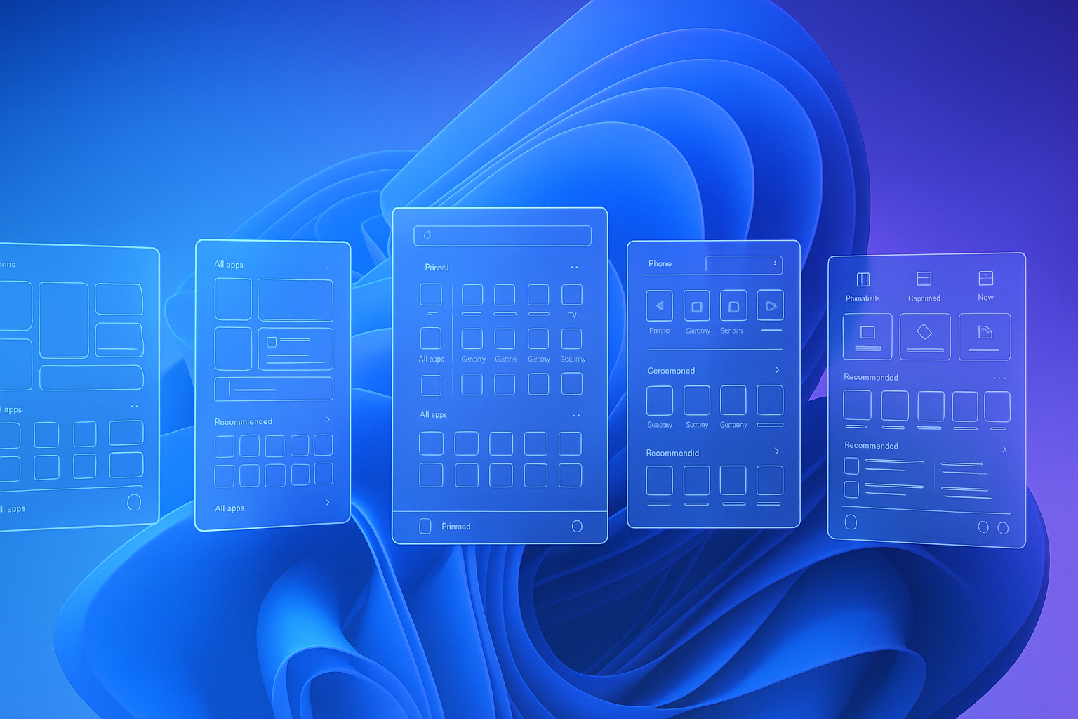
Microsoft has lifted the curtain on the design journey behind the next Windows 11 Start menu, sharing five ambitious concepts that almost shipped. The peek behind the scenes comes just weeks after the company began testing a larger, fully customisable Start menu that at last lets users ditch the unpopular Recommended feed. The Verge
Contents
TL;DR
-
Five prototypes explored widget-first, vertical and phone-integrated layouts.
-
Final design keeps a wider grid, up to eight app pins per row and an option to hide Recommended.
-
More than 300 Windows fans took part in eye-tracking and co-creation sessions.
-
Rolling out now to Windows Insider builds 24H2 and back-ported to 23H2; general release “in the coming months.” The VergeMicrosoft Design
Why Microsoft Rethought the Start Menu
The Windows design team says feedback was loud and clear:
“Help me find my apps faster… and please keep the magic.” – Windows Design team Microsoft Design
Thirty years after its debut, Start still has to feel familiar while keeping pace with multi-device workflows. Microsoft’s four “guiding stars” shaped every sketch:
-
Apps at a glance – the full library should be one click away.
-
Make it yours – pin, hide or reorder anything.
-
Accelerate the day – every pixel must save time.
-
Honour the icon – respect decades of muscle memory. Microsoft Design
The 5 Concepts That Didn’t Make the Cut
| # | What It Looked Like | Why It Wasn’t Shipped |
|---|---|---|
| 1 | Rounded widgets with a dedicated For You column full of Teams meetings, YouTube links and docs. | Testers loved the look, but the panel felt cluttered on small screens. The Verge |
| 2 | Side-by-side layout — apps on the left, personalised feed on the right. | Split focus slowed app discovery. |
| 3 | Category-first grid that grouped apps (Productivity, Gaming, Creativity). | Added taps for power users who memorise icons. |
| 4 | Vertical, full-height Start that scrolled like a phone launcher. | Eye-tracking showed excessive scrolling and lost context. |
| 5 | Landing-page Start with quick shortcuts, phone companion panel and creation tools up top. | Powerful, but too radical a shift for everyday users. |
All five were built as whiteboards, Figma frames and even floor-to-ceiling paper prototypes, then vetted in 300-plus usability sessions with eye-tracking heat maps. The VergeMicrosoft Design
What the New Start Menu Actually Does
-
Bigger canvas, same muscle memory – a single scrollable view keeps All Apps a click away.
-
Hide Recommended – turn it off entirely, reclaiming space for app pins.
-
More pins – up to 8 × N grid with no three-row limit allows dense, power-user layouts.
-
Phone Companion panel – recent calls, texts and photos pop in without opening Phone Link.
-
Category or list view – switch All Apps to match your workflow. The Verge
When (and How) You Can Try It
-
Join the Windows Insider Beta or Dev Channel on a Windows 11 PC.
-
Update to build 24H2 (or 23H2 if back-ported).
-
Right-click Start ▸ Start settings ▸ toggle off Show recommended content.
Microsoft says broader rollout will begin later this year once feedback is baked in. The Verge
Why It Matters for Productivity
-
Less cognitive load – removing clutter speeds launch muscle memory.
-
Flexible layouts – developers, creatives and gamers can all pin what matters most.
-
Consistency across devices – the companion panel bridges PC and phone tasks.
For IT admins, the ability to lock or script Start layouts remains unchanged, streamlining enterprise deployment.
Frequently Asked Questions
Can I switch back to the old Start menu?
No toggle exists, but classic-style launchers like Stardock’s Start11 still work on Windows 11.
Does disabling Recommended affect Microsoft 365 cloud suggestions?
Yes. Hiding the feed removes cloud-powered file recommendations from Start but not from apps like Word or Excel.
Will these changes come to Windows 10?
Microsoft has not announced any Start menu updates for Windows 10, whose support ends in October 2025.
The Bottom Line
By exposing its scrapped prototypes, Microsoft signals that user-centred design — not just aesthetics — drove the new Start menu. If you hated the Recommended feed or felt cramped by three pin rows, the upcoming release could make Windows 11 finally feel like home.
Sources
The Verge – “Microsoft reveals its rejected Start menu redesigns,” 13 May 2025. The Verge
Microsoft Design Blog – “Start, Fresh — Redesigning the Windows Start menu for you,” 9 May 2025. Microsoft Design
The Verge – “Microsoft’s new Windows 11 Start menu is bigger and fixes a major pain point,” 8 Apr 2025. The Verge


